So, what do you think?
You know, there's "good fazing" and "bad fazing". Don't forget "neutral fazing".
There are about 82 versions of fazing, actually, but for today we're just going to talk about the three...
Oh, and "fazing" is not the same thing as "phasing". Different things entirely!
Interesting... I'm curious: Do you guys think this new identity means a significant change that applies to upcoming products (hw/sw) OR will it be the same old (predictable) stuff only with a new logo?
A bit of a weird concept to me to change your logo based on business practices when those can change so often. Yesterday is to drop a lot of hardware, then drop a lot of content for the software, then subscriptions, then AI shenanigans, tomorrow who knows...
Now that you mention it, this may be changing. For example, Ableton's Push 3 is going to have available a "standalone upgrade kit" which will include a drive, CPU, WIFI, and battery capability. The blurbage on their site says that with further technological advances, they'll make upgrades available even beyond the current Intel i3 NUC platform...and they specifically reference as a benefit, the user won't need to discard the device just to get a more powerful one.
I like that thinking. I long for those days when we could just upgrade a CPU and only have to recycle, repurpose, or just plain dispose of a postage stamp piece of silicon, instead of hauling a whole computer to the hazardous waste collection facility in my town.
And I've done just that with several computers. In fact, my current desktop case is about 10-12 years old. I just keep swaping the guts of it out.
Unfortunately, I have no idea if AI is going to go down that path. They never did that before.
I expect predictable old stuff with a new logo but won’t be disappointed if proven wrong.
Predictable seems an adjective that fits well with NI from some years
Maybe it will be an expansion in HW form 😂😂😂
But as ozon says, I’d looooove to be so ashamed of anything I said because they come out with something really innovative
LOL, I spent decades working for big corporations. They don't change things up THAT much. When they overstep and get too daring with a logo, avatar, or other kind of brand icon, they usually change it within 6-12 months, but they'll do it very quietly.
As to ending up on products, who knows? If you look at other companies who have changed their logos multiple times over their history, you'll often see 2 or 3 rebranding attempts happening within 2-4 years.
And then you'll know it's a thing when Wikipedia creates a new page showing all the logos on a timeline and what products that logo was on.
I'd say mixed.
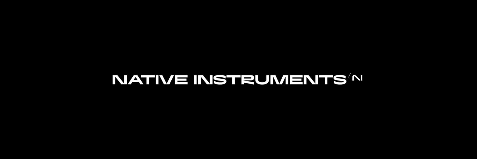
On the plus side, it's a nice design - and typographically it's more interesting than it was before overall. I have it on Kontakt and the new type etc actually looks really smart. However, I think the NI icon is a step backwards. That had instant recognition, due to years of use. It could have been modified slightly to bring it into line with the new typeface, but I don't think completely re-designing it was and the version that sits on the top left of this page feels like it misses that blue & white surround. I could live without the wordmark of the old brand as that was fairly vanilla, but the icon itself feels like it should offer some form of callback to the history on NI. Just my take.
A significant change would be what actually? I wonder...from play series to expansions all the big profitable products run on platforms which need to stay what they are right now. What exactly could enable a significant change for NI, anyway? It's mostly been evolutions of the same old trusty SW/hw flagships. The Jam was the last thing that was really new and unprecedented, right?
i don’t like it, not enough effort, way too simplistic looking.
Its NIce and i like it. ✌️😎
Logo is nice, full text looks like a sci-fi font from the 90s, horrible.
Again, NI will surely employ people in both department full time. There is no such thing as a money fluctuation due to the one or the other department being employed more or less.
I'm fazed about all that. 😁
It was about time for a logo upgrade. The old has been starting to look slightly dated for some years.
The new logo is OK IMHO, but slightly convoluted, but I'll get used to it I guess.
The full name is in the right direction but fails on execusion however. I'm sure it could be fixed. Like the R, U and S 😶. Those involved in that will not be able to put that on their CV....
Kind of sad, 14 pages with wast majority of disaprovals.
Fair enough, but precisely -there's not much I can say of a design without context, technical choices are not made in a vacuum. I also don't have a background in design, so it's beyond my reach. The logo is quite simple, there's nothing obviously offensive about it. I don't even have much problem with the font. Take the R, which seems to get some hate. It's quirky, and the quirk is easy to localize at the leg joint. That's a choice, not an error. There's no place in design for an R with a quirky leg joint? I'm sure there is, but I can't really say where that would be. The only thing I might say is that neither the logo or the text seem to play well with scaling and distance. The logo tends to collapse to just a weird N.