Native Instruments new brand identity

Options
1151617181921»

Comments

  • peter verberne
    peter verberne Member Posts: 16 Member
    Options

    Sorry guys, but your new design is NOT OK!

    I prefer the old distinguished icons with their own colors. Even the new font is ugly.

    Black and White? Seriously. Is that all your imagination can come up with.

    Please review the the old Maschine Logo and see it's immaculateness again...

  • MrFresh
    MrFresh Member Posts: 37 Member
    Options

    Looks good to me!

  • Sunborn
    Sunborn NKS User Library Mod Posts: 2,363 mod
    edited December 2023
    Options

    Most of us, having colorful, abstract, psychedelic or nature desktop wallpapers we find the black/white icons very pleasant and easy to see... Colorful icons on colorful backgrounds are horrible, a big problem, and not easy to see at all... on the other hand, monochrome desktops are ugly, boring and without imagination, so they are absolutely out of the question!

    So, i like the colors. What i don't like, and i mention it 10-15 pages before, is the fonts.... boring and very simple... but hey, its their business and their choice, same as in my business the choices are mine, and at the end we have to accept it.

    I find it really ridiculous that this thread has 21 pages... what is the point to criticize or discuss something that is already done and will not change? aren't there more important things to discuss?

  • Rikk Show
    Rikk Show Member Posts: 99 Helper
    Options

    This is a stupid idea and if comes from inexperienced marketing people who have nothing better to do and they think it matters or that we care. No it doesn't matter, it actually matters more to be consistent, not constantly changing. Ask beer manufacturer Stella Artois for advice next time, their logo hasn't changed since the 1300 hundreds.

    Close this thread now and have the marketing people work on user experience, user feedback, and sort out the missing function/features priorities together with product management and stop screwing up products. Massive X launch, KK3 sw (a downgrade from KK2.9!?) in mind here.

    Focus guys...

  • D-One
    D-One Moderator Posts: 2,884 mod
    edited December 2023
    Options

    It's hard for me to imagine someone looking at this alphabet soup and finding it visually pleasing or practical to use:

    Imagine when all icons look like that... But I guess we all have different tastes.

    It seems to me that what triggers people is not just black and white or the subjectivity of if black/white is 'pleasant' or not. It's the fact that it's all the same color + same font-based, the 2 combined leads to a generic future where no product has any identity at all... Seems like the exact opposite of the original purpose to changing things. haha

    Also, some products have numbers... I wonder if the company that was delegated for this graphic design language understands and accounts for that? Kontakt 7 is "KT", what will happen when there is a Kontakt 8? "KT 8" ? While the previous remains KT but is in fact 7? Will we have 3 or 4 KT Icons and will have to tell them apart thru text only? How the heck does one solve that? The current 2 letter language is sort of limiting, to say the least 🤔🤣

    The more products get changed to this design the worse it will get, Arturia is a great example even tho they tried using colors at a certain amount of products it becomes an autostereogram

    As far as keeping this discussion going, well, as long as a user has not made too many posts here and is just leaving his/her opinion than that's the purpose of the thread, it's a "What do you think" topic after all.

  • Sunborn
    Sunborn NKS User Library Mod Posts: 2,363 mod
    edited December 2023
    Options

    @D-One LOL... good point indeed!

    but..... look how nice they fit on a sunset! 😊


    ...plus that, it is really easy to change a shortcut icon, any time 😉


  • Nikal Might
    Nikal Might Member Posts: 24 Member
    Options

    I updated Maschine recently which includes an update to the new branding, but the previous branding was far superior. It was distinct, easily identifiable, had different colours from other NI products and was difficult to confuse with other products while still maintaining a unique, consistent brand identity.

    I have put shortcuts to Maschine and Traktor on my task bar and I can't tell the difference between them without hovering over the icon. Why? Because they both have a black background with white writing on the foreground that I can't read because it's too small and my eyesight has deteriorated. Why have NI made such poor design decisions, especially considering the amount of recent work they've put into making Maschine more accessible for people with visual impairments?

  • Milos
    Milos Member Posts: 1,927 Guru
    Options

    Am I late to the party, guys?

  • Tim Hostetler
    Tim Hostetler Member Posts: 23 Member
    Options

    I will forever miss the old look. The old logos were really cool looking and since 2012 that is what I have grown up with. I don't understand the new design and when I updated Maschine 2, I was searching everywhere for the logo and when I realized it changed.. the only thing I could think was "What the hell is this? What happened to the Maschine 2 logo? Not cool!"

  • thrush
    thrush Member Posts: 1 Newcomer
    Options

    I love the display font, wondering who is the foundry/designer?

  • DominicIsidore
    DominicIsidore Member Posts: 3 Newcomer
    Options

    It looks really good to me. 🎉 I don't know what other people are talking about!

  • Ghost_Train
    Ghost_Train Member Posts: 21 Member
    edited February 7
    Options

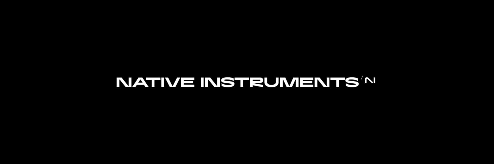
    I was pointed here after asking why the logo was changes from NI to AI.

    Obviously its not AI (only because I already know of NI), but it looks very much like it with the line not connecting in the lower right, esp. with the rise of AI being everywhere these days.

    It is indeed more sleek and shiny, but I have to wonder if that was intentional. Is there going to be more AI implementation? Its not an important question or concern. I'm just a curious longtime NI user.

Back To Top