So, what do you think?
The thing is that this logo is similar to the logos of some other companies, it doesn't stand out as something obviously special among them and is not memorable...
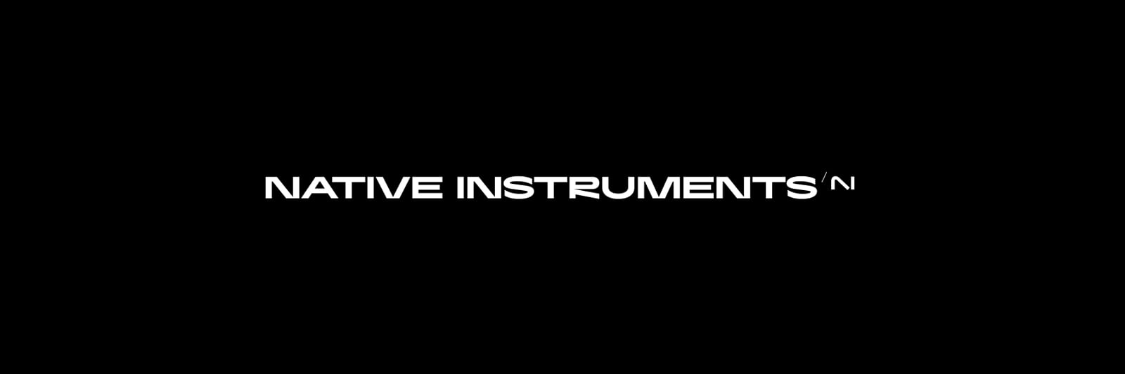
To my eyes the diagonal line of the "N" seems disproportionate compared to the vertical lines, the hard line of the end of that N sweep also seems to be abrupt compared to the sweep of the knee and the angle between where that N ends and the I sits doesn't feel even and doesn't seem like these 2 characters fit. The fact it does break that horizontal line is what makes me dislike it visually so it's something that seems to divide opinion.
The N is also not an N it is more like an A, it would be more clever if it looked like the whole thing was originally an N but was cut and makes an NI which is what I assume is suppose to be the case, but it does not look like it flows.
My eyes are subjective consumer eyes but unlike the examples above which all have a certain flow and symmetry, looking at the NI logo at the end is displeasing to me because of the points I made and it just doesn't look original like the other examples, it's doesn't seem to have that "easy recognition" to it. Still makes no difference to how I view them as a company, just dislike the faults I see in the design
I absolutely agree. Exactly the same feelings and thoughts
The new logo and font doesn't represent ni. It looks out of context and ridiculous. They should revert to previous one or come up with something better.
Looks like AI (the fad of AI as a buzz word is cheap),.....overall you've lost any sense of identity, it doesn't connote progressive music tech, just looks futuristic for nothing...The original Logo / Identity has a clarity that doesn't beg to be futuristic, it housed both the heritage of the classic whilst being a pioneer of innovation. The update IMO its a fail. Even future hardware with this new logo will look like a Korg M1
April fools 2024 ?
not Bad a little more Simplified, Just make your software a little more simplified as well for newbies 🙂
Not great. What's going on with the letter R - looks like someone drew a P and added the final stroke as an afterthought.
The icons look awful on a Windows machine, the TR looks all squashed up and barely readable. I've got my Native Access and Traktor icons next to each other on the taskbar and they look very basic and childlike next to the others.
I don't know why you need the little accent between the words either - in TP3, why have it as TRAKTOR'Pro'Plus ??? Just Traktor Pro Plus will do thank you!
That’s an interesting way to look at it. I’m not a big fan of the logo. I wonder if there was a consultation with NI’s user base? I didn’t hear or see that there was. It would make sense to hold off launching new hardware if you were rebranding. I hope new Traktor hardware makes an appearance this year. Traktor 4.0 is just around the corner. With the new branding it would make good business sense to bring new hardware to the table. I’m hoping anyway. Let’s see.
Heavy dislike of the logo and the text. Sad to say. Just my opinion without much discussion of why. Just feels cheap and thrown together. Not distinct. Doesn't make me identify with the brand or want to do business with it. Not elevated or sophisticated. I really wish I knew what it was supposed to convey because I just don't get it.
A few folk have suggested that, but none of the examples given are close, and definitely could not be confused for this. If it was close enough to another logo to be mistaken for it, then just tell that company, and they will 'cease and desist' NI to protect their own trademark - simples ;)
To me it seems original and distinct enough that after a while it will become as easily and immediately recognisable as the examples in JesterMgee's post.
To my eyes the diagonal line of the "N" seems disproportionate compared to the vertical lines
What are the correct proportions for a graphical abstraction originating from the letter N and I ?
From an abstract POV, compositionally it is very well balanced. It is very simple, but there is still tension and resolution with the curved knee at the top and the angular separation at the bottom, one on the line, one past the line. There is also a nice call and response with the more lyrical curve and slope of the first part then a pause, and a clear resolution of the straight vertical section to complete the statement. Having the downslope finish on the line would make the vertical 'I' a little to strong and abrupt, but having the downslope just cross the horizontal at the base softens the impact of the vertical section, moving the focal point inwards slightly and improving the overall balance, it also adds character and uniqueness.
Yeah, all I can say really is to my eyes, it don't look right to me and I don't find it appealing or unique, subjective but seems to be echoed by many.
Most people didn't like the new logo, nor the ugly new font...
@JesterMgee
Hmmm, I think you may be underestimating the importance of how impactful logos are.
Why do people buy into these considering there are so many better options for the cost:
I didn't express myself correctly there. I meant in terms of reading deeply into "what the logo design means for the company", like a new direction, target audience or visually looking like "Ai" on purpose because NI will follow some kind of AI path for it's software, they would anyway like most SW companies since that's the trend, as is subscriptions for example; and they already changed direction a long time ago.
As far as the Apple, Nike etc logos I actually do appreciate their logos being quite iconic, most of the logos you posted aren't just 2 letters, they are iconographic, hence can't be easily confused with anything else, I like that. Natives old logo having that icon around the letters made it way more unique in this sense than the new one, the old blue color too. Like Orange amps being orage, or Focusrite having red interfaces.
Yeah, many people definitely buy things to show off logos, especially in fashion where a plain t-shirt with just a logo is so often desirable and people don't mind being a walking advertisement... 400$ t-shirts with just a logo are crazy to me but lots of brands sell them out. But a logo only sells as the main identity after the company becomes super popular.
If for example, Apple's identity were: It's a cheap brand of low budget, plastic computers, phones, etc... no one would want the logo to begin with, their identity is much, much more than just their logo, it's probably a very tiny part actually.
Echoed by many is true, but then there are many folk who are not happy with NI because some product isn't getting enough love, or is going in the wrong direction. So when some change comes along that isn't the thing they want for the product they are personally invested in, it is immediately a negative. That seems like a general trend on social media and the internet - if something isn't exactly the thing folk want, they will be extremely negative about it. Polarisation is pervasive these days.
If it was my choice, I would probably have gone with a refinement/modernisation of the old logo, but NI clearly wanted a clean break from their old brand identity, so they want with this. I'm personally not sure that the change is a good thing, but for me, that is separate from the qualities of the replacement logo. I suspect for many folk it is not so easy to separate those things because emotion gets in the way, and many folk will kneejerk to a polarised opinion, and then be stuck there!
I don't know why but this change has really irked me. Taking a look at my F1's, X1 and Z2 and thinking that any future hardware I buy is going to have this new wonky design on it has really got my goat.
For reference, here's the old and new taskbar icons for Native Access and Traktor, alongside the Traktor branding which appears on the left hand side in the Traktor UI. (there's a slight blur on the image because I think uploading it has stretched it slightly)
The new Traktor icon is not even legible.