So, what do you think?
It's just not right....the lettering is plain wrong, it doesn't translate to scalable UI's etc. Looks like a graphical designer that only works for print was involved or something..blech...
I like the logo. Even more seeing it next to the old – I think it's much nicer. I immediately recognised what it was trying to represent (and it doesn't look like 'AI' to me). If I was considering t-shirts, one with the old, one with the new, I'd buy the new. But I like abstract minimalism. As do many other people.
The font for the names is interesting. I did not like it at first but seeing it in context here vs the old, it has much more personality. The old font looks generic. The new looks different, more recognisable.
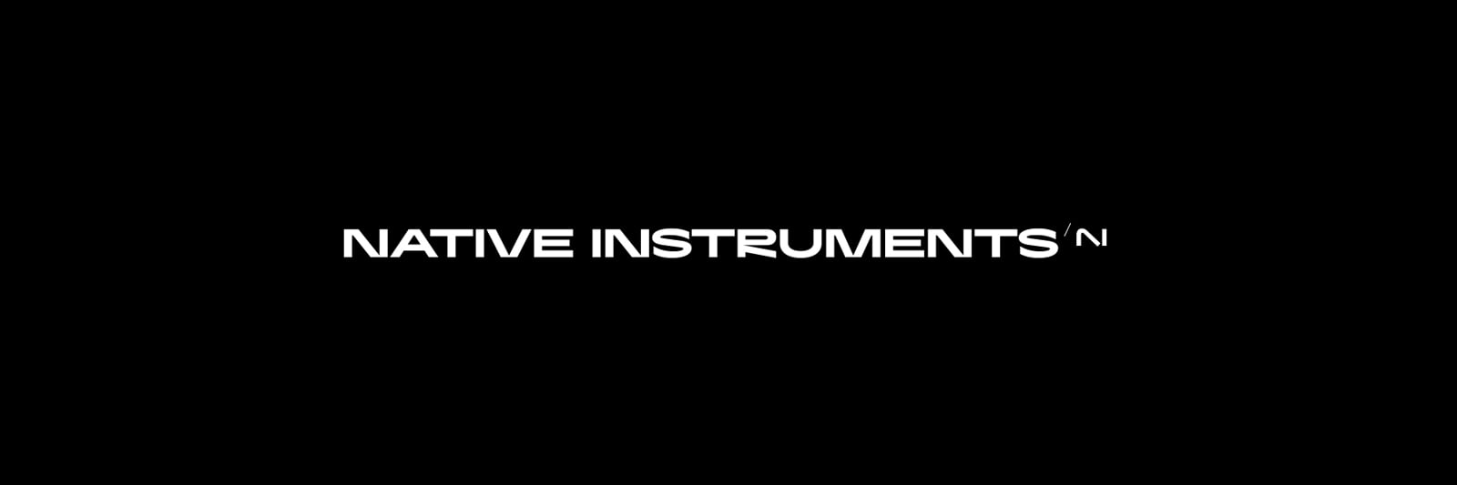
But the R in 'Native Instruments' looked so obviously wrong that when I am reading the word 'Instruments' my eye sticks on it for a moment while my brain tries to figure out what it is. From context it's an R but it doesn't look like one.
Even seeing it in context of 'Traktor', which validates my impression that the dodgy looking leg was intended to match the position and angle of the lines on the K, while it looks better and more obviously an R, it still doesn't quite work for me. I understand this is subjective. But it does not bother me the way it does some people, and I wouldn't care if I had hardware with that showing.
Regarding the iconic logos posted, I think the Tesla logo is one of the ugliest I've seen. It looks like a skimpy one piece swimsuit with arms attached to a hanger. This is just my opinion and in no way intended to represent what most people see.
While most people who've posted here may dislike the changes, as with negative reviews it's always best to understand that people who are satisfied with something are less likely to post about it than people who are unhappy. This is why we don't see lots of posts from people saying 'all my NI products installed and are working' or 'Native Access has given me no problems'. We don't have enough information to say 'many/most don't like it'.
Colin, this starts to sound both condescending and negationist. Not all people with opinions and perspectives different to yours are "emotional" about them. Some may not even care that much, and still not agree with you. I really say this from a place of respect. The idea that management has been sinking the company for some years now has broad support. You can of course think otherwise, or consider the discussion itself harmful. Personally, I couldn't care less about this or any logo, I just honestly hope this was backed by some solid market research.
It feels like that instance a new manager comes on and changes for the sake of change... like "I AM HERE and this is MY WAY". Change this and this because, I said so. lol
Add to that now my checkouts are now translated from Deutsch to English and even adds an accent to my last name.. instead of just being in english. I had to erase the "de" part from the url for it to be in english.
The "Experience" has taken a hit, not the end of the world but nah, feels like you wasted time and money on this instead of focusing on the what brought us here. -JMO
Money doesn't grow on trees. If NI are paying people to do marketing, then that money is not being spent on developers wages. NI doesn't have an unlimited bucket of money to pay people with. If they're spending it in one place, they're not spending it in another.
Not a fan. I prefer the old branding. It was classic. I feel like the new branding is trying too hard.
Most of the logos you posted aren't just 2 letters, they are iconographic, hence can't be easily confused with anything else, I like that. Natives old logo having that icon around the letters made it way more unique in this sense than the new one, the old blue color too. Like Orange amps being orage, or Focusrite having red interfaces.
Yeah that's a fair point, possibly the need to redesign is a way to try and reinvent a visual appeal with logo that isn't just the letters. Like you say, the recognition for most companies comes from the logo, in some cases you may even know the logo, it seems familiar even if you dont know the company or even use their products, just subminimally.
In any which way, seems they have probably been discussing and arguing about all of this for a while in the background and what we have is someones final decision and like most things us users complain about, makes no difference what we think or feel, it is what has been decided so best just get on-board if you want to ride the train...
Quite a number on this thread have stated how they hate it, or words to that effect. If that's not an emotional reaction, I don't know what is!
Well, they asked what people think. "I hate it" is a pretty normal answer for anyone who's not a graphic designer. It's not so much extreme as intuitive and general.
I don't hate it, in fact I feel very little towards it, because it has no context. The old logo signifies everything associated with the brand. It doesn't matter if it was purposely blended by a coherent design or not: there's a history and a familiarity that makes it all coherent now. I can picture Kontakt, Reaktor, Guitar Rig, Maschine, and it all lives in the same space, and that space is marked by the old logo. This is a completely different sign, so it suggests a change... to what? What's the drastic change in content that this drastic change of sign reflects? At this point, we don't have a clue, and instead we have reasons to wonder: do they? This company has been stalling and shrinking since way before it was hip, shuffling the workforce through change after change of management and ownership that was always announced as a beacon of hope, to end up barely reflecting on the product line. Then, out of the blue, they throw this empty gesture. Until it happens to be filled with something real, I can't read more in it than mild confusion.
Definitely agree with all that... but...
I think we should be able to separate worries about the reason (or lack of reason) for a change of identity from the actual logo itself. I agree that such a big change is somewhat worrying, and comes as a surprise.
But the logo itself is not bad at all. No-one has convincingly explained what is wrong with it as a piece of design. There was a suggestion that the down slope it is out of proportion... but if that was true, then it would be an easy fix... I don't like that folk are hating on a piece of someone's work that is absolutely good work. It's not the designers fault that NI don't communicate effectively with their customer base.
What we should all be shouting about is - why is there a radical identity change? does this mean it's time to go and search for an alterative to the NI software/hardware we use? or does it herald a restart with more investment, closer community involvement, and more regular updates? or is it just easier and cheaper to 'modernise' the branding instead of the products, and everything else will just stay the same?
I really like it! Good job!
with more investment, closer community involvement, and more regular updates?
Long-term experience, including current events, shows a complete lack of close involvement with the community... Rather the opposite - they have further distanced themselves from the community, as exemplified by the fact that they did not even conduct surveys among community members (those who are essentially customers who buy their products) before approving the new logo design and new font, i.e. no marketing research was conducted among their customers...
The only question about the new logo was asked in the first post of this thread... ... And that question was not asked before, but post factum.
The feeling is that the decision was made by one person, and he created a new logo and font, without the consent of the rest or when he was told that the new logo and font do not fit, he told them that they do not know this and only he alone knows how to do it right ...Ahahahahah))))))
That's a terrible idea, unless your intent is to have FEWER people participate in the casual music and plugin talk. I don't "do" discord, and I'm not the only one who doesn't. I already have like 165 forum IDs and passwords to track. No more, please. Stop the madness!
Oh I noticed it. I just don't get all that excited about it because nobody asks the customer for input until AFTER the decisions have already been made and cannot be revisited.
That doesn't mean the new products won't be good. They sure could be. But I won't know anything until they make an announcement of something. And that probably won't happen until after July.
Besides that, Ableton is having trouble replenishing stock of the Push 3, so that gives AI about 5 minutes to come up with something.