So, what do you think?
Agreed. This is why my issue isn't based on if it looks better or worst in terms of aesthetics, I legit don't care about that but losing the icons + color seems like a super weird choice, everything will look alike and super generic. Soon we will have 20 2-letter black icons, lol!
Assuming this will happen i wonder what they will chose, because both MA or MS could also be Massive 🤷♂️
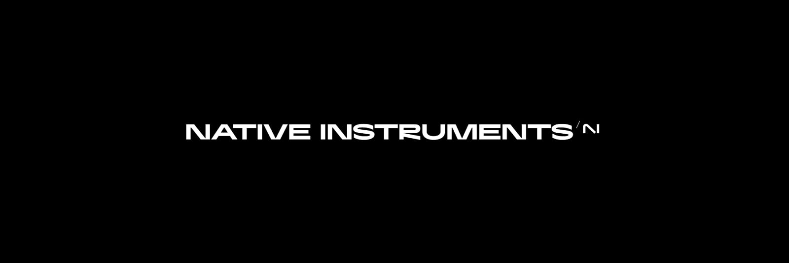
NI's logo in Native Access being taller than the other 2 letters 'icons' triggers my OCD a bit.
Whatever agency did this, I applaud their rhetoric to explain their reasoning + the beauty of their mockups that I have never seen but assume were amazing enough to convince the company to spend thousands on this. 😂
Ugly, ugly and ugly again...I want to deal with NI products less and less...Sadly ...
@Kaiwan_NI So…you asked users what do they think. I think the answer after 16 pages is more than clear: vast majority don’t like it at all. Which in facts, doesn’t even matter too much. But now with the icons users are also trying to explain why this is a problem for them. Is not anymore about what they like or not. It’s about having 10 icons all the same with just letters having a bad impact even before starting to use NI instruments, cause we even have to think before opening something.
Now WE ask YOU what do you think. Will the opinion of the people who has to use these programs matter something or not? You asked us to have a feedback for a reason or the dice are already rolled and nothing will change?
I have a hunch that we probably won't get a response from Kaiwan_NI or will get one very long term.
This has always been NI's relationship with the community and this is a huge disadvantage for NI....
Honestly it's boring and reeks of the same design aesthetic that plagues all of tech and many major corporations. Take all the details out of everything and make it look like abstract line art.
I bet a mountain of money went to some design firm to redo all the branding and this was the best they could come up with. Some genius new management suits got a big up for modernizing NI.
I guess that Maschine+ update can wait.
You forgot to add quotation marks to the word "genius"...Haha
You have actually helped me make a decision about buying more NI hardware. And that answer is don't. They update Komplete like clockwork so I'll keep on with it. Looks like an MPC is in my future instead of a Maschine Mk3 or +
The trick is to buy NI controllers used. That’s how I ended up with my current collection.
So currently on my desk are a Maschine Mk2, a Komplete Kontrol S61 Mk2, a Maschine Jam, and a Traktor X1 Mk1.
And I’m using them pretty much as straight MIDI controllers with Cubase.
They aren’t perfect, but on balance pretty strong compared to most controllers I’ve tried.
@LostInFoundation asked:
You know the answer to that question. Asking "what you think" doesn't mean that if the answer isn't positive that they will instead take it back... or that it matters. If user's opinion barely matters for actual products why would it matter for something far less important like logos?
Is this going to be a "never ending saga"?
What are you talking about? Case is closed, the new design is here already, your opinion obviously does not matter, so what is the point of still commenting on a dead case?
If your goal was to fill up our mail box with notifications, on a matter that is totally out of our interest but just made the tragic mistake to comment once, weeks ago, then, congrats, well done! 😁😛
I hadn't realized the icons are replaced with generic letters yet, wasn't at my computer for a few days.
But that is totally in line with the graphic design choices on this forum. Generic blobs obfuscating what they symbolize and wasting vast amounts of screen real estate. When I complained about how this is making navigation in these forums a PITA, @Kaiwan_NI said something to the effect that those were an intermediate solution, iirc. Well, that was weeks ago and now the desktop icons look all the same...wow
I once had graphics software which did away with the colorful icons representing their tools in favour of slick uniform grey buttons (like PS had at the time). Yes, I understand, that a uniform grey surface might look like a sports car when you squint your eyes, but colour is important and I just realized I don't feel like explaining s4!t like that anymore to people who either don't care or can't do anything about it
Suspect this change comes ahead of the planned release of new hardware.
Like new branding, but forum has css menu blinking error with ipad in portrait mode
wow nice chance!
No idea if it was an external agency or internal design but its a disaster.
I asked 5 people about the Logo what they think what brand that is at least 3 of them did know nativbe instruments their half life. ALL 5 were reading AI and not NI.
there is a border for reducing design and minimalsim to be still recognized and u surpassed that border by far. you gave away your brand identity.. your logo was alreadys a classic. for a redesign you had to keep the 2 half contrast design and the basic shape within that u had several options to be creative and look "more modern" to break up a part of the outline or whatever. But as it is now it looks like a volonteer did that in the lunch break.
...ah and the R in the Full word you want to show you produce in China to include a Chinese sign?
i mean WOW. incredibly bad made....
its a bit sad as well.
But good luck on ur way.