So, what do you think?
As a graphic designer I find the "designing logos" paragraph a little simplistic! You are talking about a corporate identity not just a logo! It is equivalent to suggesting a musician can just find a loop for the drums, a loop for the bass, loop for the guitar and then just sing over the top and have a great song (although probably some do achieve it that way)!
On the other hand a good software designer is really just someone who can type in code or copy it from another source.
Okay, I AM totally joking in regard to the software designer bit! . . . just making a point 😎
To be honest, I don't like the new logo and fonts now being used all over the website very much. It's a matter of taste of course and even not that super important, but... I don't know. It's sad to say, it's just another choice among many others, which adds to the feeling that Native Instruments is not the company anymore, that I once valued so much.
When I saw it the first time at the top of the forum page, I thought the page didn't load correctly and tried to refresh it.
Then I was kind of excited, hoping there is something new coming. I could care less what the logo and such is.
I would wear a shirt or hoodie with either on it.
The new logo and font are completely disharmonious, not memorable or appealing... I find the new logo and font absolutely disgusting...
In addition, instead of devoting resources to the immediate problems with existing products and the lack of feedback on suggested features, they've devoted some resources to rebranding...
I have a very strong feeling that for me personally, NI's time has passed... Well - everything doesn't last forever.
Really!? You're surprised??
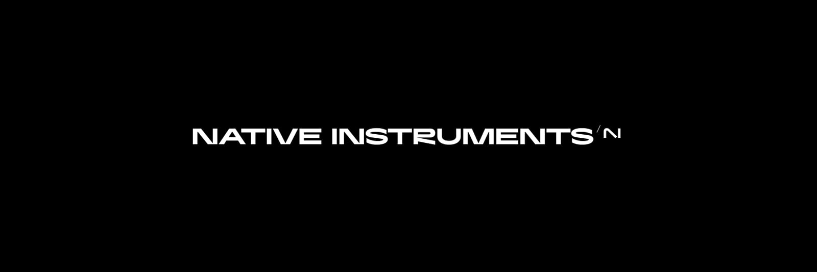
Just to be sure, we're talking about this "R", right?
I don't think I have ever seen an uglier "R" in a professional logotype.
Some of the links are changed their thumbs also. Fine!
Yeah, no guys, sorry.
I started to wonder over the course of the last few days whether it's actually not by accident that the new logo reads AI rather than NI. Maybe there's a redefined vision ahead of how NI will be doing business ?
A bit of a weird concept to me to change your logo based on business practices when those can change so often. Yesterday is to drop a lot of hardware, then drop a lot of content for the software, then subscriptions, then AI shenanigans, tomorrow who knows...
Hum... Those big design companies that get hired to do corporate logos and charge insane amounts are really great at presenting conceptual arguments for their choices, beautiful mockups, etc... I'd say that's probably a huge part of the job... Like one can make a long and deep explanation as to why a canvas with a single dot in the middle in an art gallery is "amazing", the explanation can be valid but it can also be a load of poop just to sell you the concept.
Considering the explosion of AI stuff recently these 2 letters should appear in a million logos, purposefully making your logo look like a million other generic ones seems like a great way to not stand out and stick in our memory, almost counterproductive in terms of marketing. Like making a shoe brand and using a logo that looks like NIKE sounds like a mistake to me.
Personally, I don't read too deeply into this, it's just a logo... It's like 5% of brand's real identity, especially if it looks generic.
Something along the same lines but slightly more familiar...
Same thing I was thinking! +++
Awful, I mean look at the “R”. Absolutely terrible looking.
In fact, everything there is terrible, every letter. The new logo is also terrible... Everything is totally disharmonic... The only emotion I have with the new logo and font is sadness.
Totally agree about the font, but not the logo!
What about the logo is disharmonic?
To me it seems good. Semi abstract, well balanced, minimalist, and that little detail of the corner on the down slope breaking the horizontal at the base is a really nice touch. It's also easily recognisable - after a few months it will just mean Native Instruments at a glance - which is the whole point.
I still hate the banner font - it's objectively bad. The logo is not, there's nothing objectively wrong with it. And personally I like it so :)
..and also the banner graphics with all that weird blue floating crystal disc stuff that looks like it's straight off a detergent package, or air freshener... they don't look quite so out of place with the new logo, they make more visual sense now than with the old logo.
That would have made way more sense as a logo and looks more appealing (imo), just a little "simple" and a designer would probably feel it's a bit uninspired and "easy" of a design
Hmmm, I think you may be underestimating the importance of how impactful logos are.
Why do people buy into these considering there are so many better options for the cost:
Without even saying what these are, you already know and you also probably know just why people buy them, and why that logo is on the sides of these in clear sight. Without it they look like any other pair of cheap cans, most people aint buying them because they sound "the best" for the cost, they are good but the logo is what people want to show off.
Same as when we see this logo, we know who and what it is all about without any words, minimalistic design but impact is one of the things Apple has been very good with:
Brand recognition and logos are something companies invest millions to perfect and protect. It is the very first impression one gets on a product. That's why Apple don't use their original logo from the 70's:
Although it has more meaning in it, it is hardly as impactful as the current logo.
Apple hit on that perfect simple design and have simply changed the style of it over the years, no matter how it is revamped you always know what it is...
It works for any company that has perfected their brand and you instantly know who they are and what they are about just from the logo, not a single word or letter needed:
That will be a hard thing to reinvent and (IMO) NI loses all that 20 years of groundwork with their original logo, but maybe that is then point, I just personally don't see it making as big of an impact as the above examples
To my eyes the diagonal line of the "N" seems disproportionate compared to the vertical lines, the hard line of the end of that N sweep also seems to be abrupt compared to the sweep of the knee and the angle between where that N ends and the I sits doesn't feel even and doesn't seem like these 2 characters fit. The fact it does break that horizontal line is what makes me dislike it visually so it's something that seems to divide opinion.
The N is also not an N it is more like an A, it would be more clever if it looked like the whole thing was originally an N but was cut and makes an NI which is what I assume is suppose to be the case, but it does not look like it flows.
My eyes are subjective consumer eyes but unlike the examples above which all have a certain flow and symmetry, looking at the NI logo at the end is displeasing to me because of the points I made and it just doesn't look original like the other examples, it doesn't seem to have that "easy recognition" to it. Still makes no difference to how I view them as a company, just dislike the faults I see in the design