Wrestling with screen designs for my next instrument

Chet Singer
Chet Singer Member Posts: 56 Advisor
edited April 2022 in Building With Reaktor

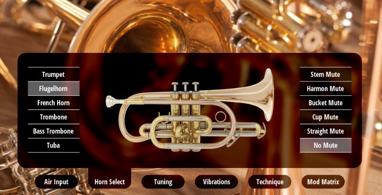
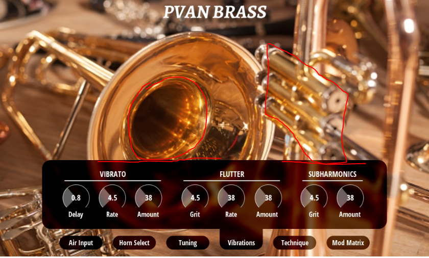
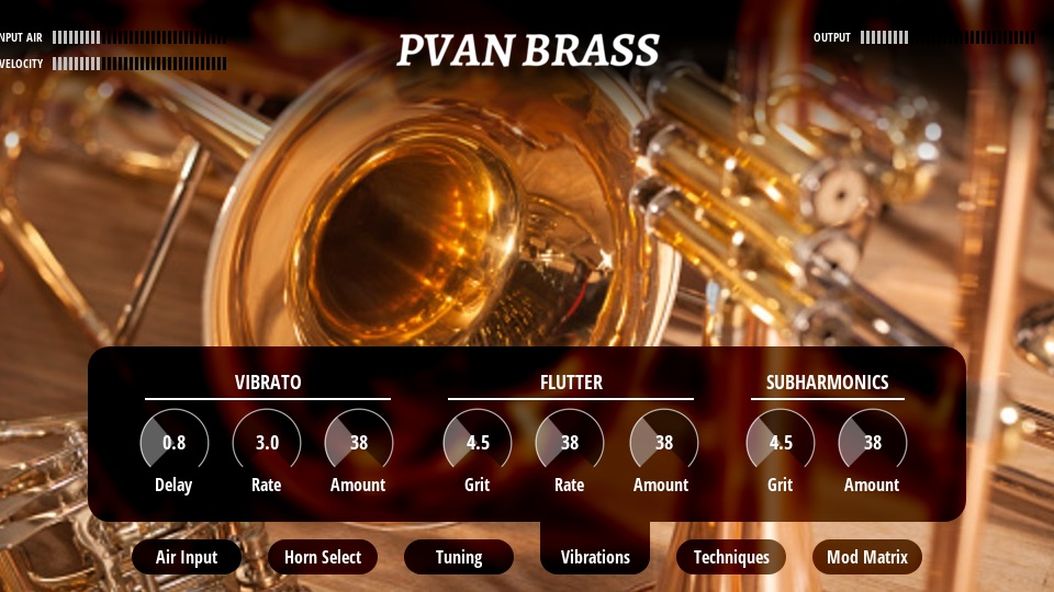
I'm building an ensemble and am wrestling with two different GUIs. They're for a brass sample player that plays back phase-aligned samples, similar to a saxophone ensemble I posted recently.

It might be my last ensemble for a while.

I'd like opinions from builders and musicians. So, I'm posting three screens of each of them. Neither is finished, but the spirit of each is there.

Here's the first one.

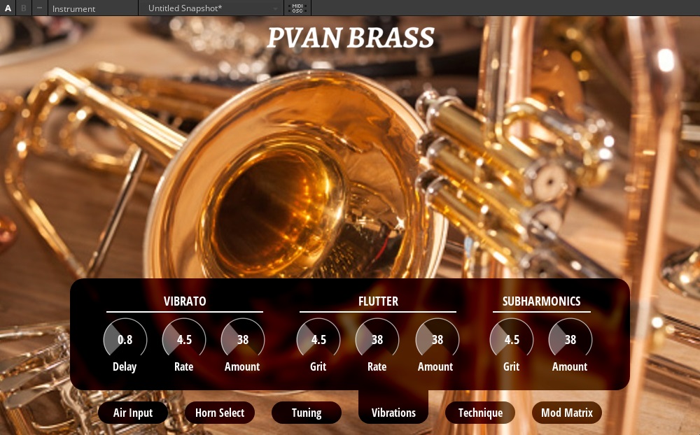
And here's the second one.

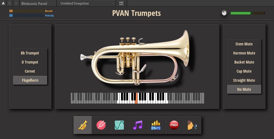
The final result is probably going to be something similar to either one or the other. Thoughts?

«1

Comments

  • Jonathan Tremblay
    Jonathan Tremblay Member Posts: 12 Member

    The first GUI seems larger than it needs to be imo.

  • Paule
    Paule Member Posts: 1,328 Expert

    Myself like the second with the calm background. Chet it's an instrument not a graphic challenge.

  • KoaN
    KoaN Member Posts: 103 Advisor

    Both are nice i think.

    The first one reminds me of a Kontakt instrument,the second one is easy on the eyes,softer and easier to differentiate the parameters,functions.

  • Chet Singer
    Chet Singer Member Posts: 56 Advisor

    Thanks for your opinions, guys. I appreciate them.

  • Bolle
    Bolle Member Posts: 349 Pro
    edited April 2022

    I think the first one is pretty dam perfect. A very attractive, clear, clean and professional look that reminds me of some of the best looking instrument emulations out there.

    First i thought the GUI size might be a bit big, but no. If it's sized the way it looks when i click on these images, it's perfect.

    The second GUI looks more like a cross between a mobile phone app and a VST instrument from 10 years ago. Like something that comes free with DAW software. It doesn't look bad necessarily. It just looks dated.

    Compared to that, the first one looks so fresh, it sparkles. Like a premium instrument that you pay good money for. I want it!

    Greets,

    Bolle

  • KoaN
    KoaN Member Posts: 103 Advisor
    edited April 2022

    the first one looks more modern for sure,shinier,more balanced too...and the second one looks definitely like an old app but i guess i first looked at how quickly i can identify the functions and i usually prefer minimalist low contrast style...the icons could be a bit more modern,and maybe less colors around too.

  • colB
    colB Member Posts: 761 Guru

    First one is way to shiny bright for my tastes (maybe the positioning of the bell end?), but I can see what you are going for, and it will definitely work - maybe finding a way to reduce the amount of shiny brass?

    Second one... I get what other folks are saying, needs more work... but maybe I have an idea what you were aiming for - that nice flat matt kind of look? Just that the shadows between the panes are way too deep, and maybe the coloured knobs and cartoon icons don't go so well with that style? Also, the glowing screens are cool, but again maybe they don't go with that modern matt look - better with a more abstract graphical display look than a 'realistic' glowy screen?

    If I had to pick from them as they are, I'd go with the first. But if you refined them both, then who knows :)

    The first one just needs minor tweaking, the second maybe isn't sophisticated and refined enough yet for the type of instrument you build... not fully coherent yet?

    Anyway, they both look very good, so definitely on the right track 👍️

  • Chet Singer
    Chet Singer Member Posts: 56 Advisor
    edited April 2022

    Thanks for your comments. I can dial down the contrast on the first one's background, reducing the glare. And that's an actual flugelhorn this time.

    I kinda like the glare, though. I'm drawn to the garish.

  • Bolle
    Bolle Member Posts: 349 Pro
    edited April 2022

    I agree with colB but think the BG image glare is not where the issue is.

    I might risk sounding designerish or seemingly replying for the sake of arguement, but i'll attempt to demonstrate what i'm trying to say with an example.

    The amount of glare in the BG image itself isn't the issue. In fact i would give it slightly more contrast, and not less, to make the whole look less uniform. Also: not one particular element of the design is causing it to look off. Everything is right. Colours, font choice, menu and control lay-out, BG image... all really really great.

    One of the rules of good design is "give the eyes something to rest on". If everything draws your eyes all at once it becomes uniform and it's not balanced well enough. Contrast and balance. You've created contrast to some extent with the overlays that hold the controls but it's not enough to make the whole pop.

    Here's an example of a very similar instrument, that i think demonstrates better balance in design and therefore has a more pleasing effect on the eyes. My point isn't to copy all or part of the design. Just to point out that creating balance and contrast creates a better effect with almost exactly the same design elements.

    The most important difference, i think, is not the fonts or the controls or the menus or whatever. The most important difference is the BG picture. It has way less "going on". It's less crowded. No buttons no curves no mouth pieces no half orchestra. Just the front part of a trumpet, some contrast and plenty of defocus in the background.

    This concludes my TED talk. 🤣

    Greets,

    Bolle

  • Chet Singer
    Chet Singer Member Posts: 56 Advisor
    edited April 2022

    Thanks, Bolle, and that's a nice-looking instrument. What's the name of it?


    EDIT: Ah, nevermind, I found it. Looks good.

  • KoaN
    KoaN Member Posts: 103 Advisor

    You are obviously very good and knowledgeable on this but i would add that for me in terms of a GUI for a synth i wouldn't judge it the same way as a picture.You also need to have balance,elements fitting with each other,nice color theme,right amount of contrast and all but the most important stuff "at least for me" is how quickly i can remember and identify the controls,what impression do they have on my brain.

    The last image you just showed is very pretty and balanced as a picture but the first thing my brain sees is a huge trumpet with tons of details and the big white letters "Brass",i find that distracting and the controls are kind of secondary to that,they get lost and all look the same,i won't be as quick to remember and use them.

    I guess that's why i prefer flat design and for functionality,it can still be nice but just trying to attract the attention at the right place.

  • Studiowaves
    Studiowaves Member Posts: 451 Advisor

    I like the first one for the simple reason it makes me feel like playing. It's the real deal.

  • colB
    colB Member Posts: 761 Guru
    edited April 2022

    Apologies for nit picking, but since we all seem to be getting into a detailed analysis, here's some more of my tuppence worth...

    Back to the first post. Part of the issue is just too much shiny brass. Just cropping it so that more of the screen is functional and less is eye candy could help... like this (excuse the very quick 'by eye' crop job:)). Enlarging the control pane would have a similar effect and may be a better option, but that's hard to demo using windows snipping tool!

    In this cropped version, the brassy background no longer overwhelms the more important control section.

    The other problem is in the second pic where the control area is smaller. In that pic, the whole of the hole in the horn is visible, and the top of the control pane just touches the edge of the circle. To me this is problematic. same thing with the bottom of the trumpet valve section.


    It's clear that the control section should be priority. But in this pic, those two background elements are winning the fight for visual dominance. To ensure that it has visual priority, the control pane needs to 'chop' the dominant background elements. This does happen in the first picture, the hole in the horn and the valves in the other one are both chopped in half, and it works much better. It is visually clear that that is just the background, so our eye is not dragged there.

    Maybe the control pane should stay the same size, and just have the controls reorganised to achieve this? Make 'em bigger :) bigger controls are generally a good thing if it's a sensible option!

  • Chet Singer
    Chet Singer Member Posts: 56 Advisor

    I'm hearing what you guys are saying about toning down the "brass". So here is a new set, shrunken from 1000x600 to 960x540. The very top of the picture wasn't that interesting anyway, so trimming 60 pixels from it didn't result in loss.

    I also liked how the Muze brass darkened at the top and bottom, so I darkened the top of this.

    The Vibrations page still reveals the bell and valves, but I'm fond of them so I'd like at least one of the pages to do that.

    I think it's a step in the right direction. Thoughts?

  • Michael O'Hagan
    Michael O'Hagan Member Posts: 93 Helper

    It would take more time but you can have different graphics on the A/B panels, so you could just let the user choose.


    They both look great, but I like the second one better as the first one feels a bit busy for my eyes.

Back To Top