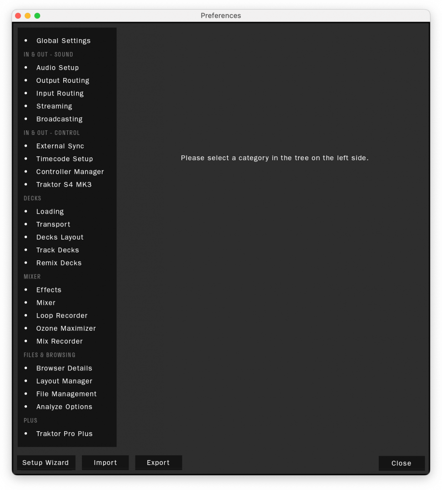
The other day I started thinking how that long list in the preferences is semi-random, and pretty hard to navigate other than by reading and thinking about each list item... every single time you visit it.
I thought the simplest solution would be a slight rationalisation. I sketched up two suggestions, one which names each chapter, one which does not.
To me the groupings are pretty self-evident (or at least rational), so in a few visits, you should know where on the list you're going, saving you precious seconds – and if you are gigging those seconds do matter.
I also threw in an imagined retina interface, maybe there will be technology one day that can make that happen. And a big readable font, and slightly bigger white on black type because tiny gray letters are very 00s (and so are my eyes, booo)
Anyway, this should be an easy one, if implemented.