So, what do you think?
I always wanted a different logos on all my hardware to my software.
Hope this has pushed existing stock up in value.
In short -- you need to work more on it.
I think they should have used Comic Sans, it's the world's most superior font - This is a non-debatable fact proven by NASA scientists and 99% of typography experts and designers agree.
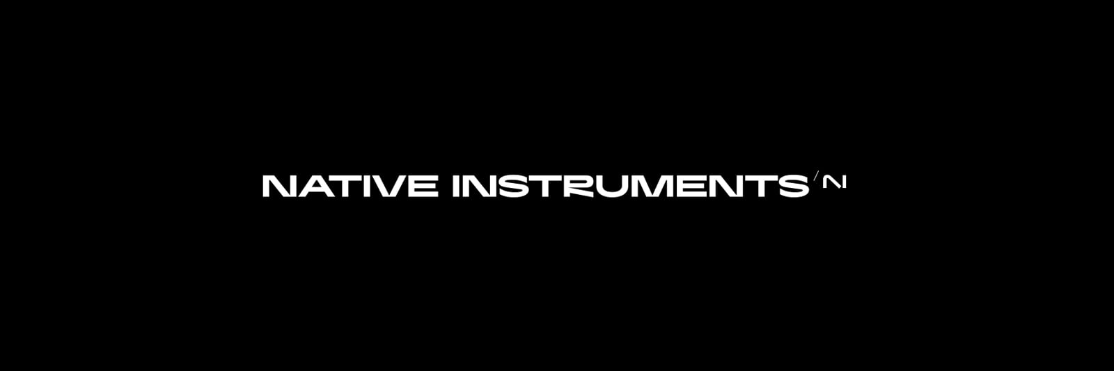
@Lionberg Yes, this is better, as N also makes "sine" wave. It signifies sound, the main field of work of NI.
Just, I would skip the dot. Why to stick to NI, N is just fine, IMHO. In this case.... If one would insist on NI, I would remove the dot and made small slot above turning to create short I. It would be sort of fused N and I making sort of sine wave.
Company (developing SW for electroenegry industry), I used to own, has N as wave. Customers did like it.
Fully agreed, thousands of birthday cards can't be wrong!
Nizotopabra
Hehehehe)))))
And it’s not about releasing anything new either…
THe logo is just bad design , non stop
If it wan't for the words 'native instruments' one could read the logo as A.I. , artificial intelligence .
The logo that looks similar to other brand logos is a free marketing. Riiiiight?
not a marketing ninja ... 🙃
Not liking it, at all. Even if the old logo was a bit aged, it was million times better. And the new typeface... just awful. Traktor's GUI was already updated with the new logo and typeface and I can't stand it. I'm afraid Maschine and others will get the same treatment eventually. Can someone make a hack and bring back the old look, please?
@Sami de Sousa asked:
Can someone make a hack and bring back the old look, please?
What are you talking about? The app icons? Since you're on Mac you can just copy and paste any image to an app if you right-click it... Like this. Super easy.
I could add a hack to NIPatcher to change all modern GUI image elements back but if people don't even care about hacks that add functionality and actual features requested a million times i doubt users would actually care about this significantly to justify any time spent on it.
Oh, we Do care!!! ....but still waiting the Windows version... 😀😉
Well... You do, and maybe 3 or 4 others, a very small sample. I think the small engagement kind of proves that even if it only requires 2 or 3 clicks to fix an issue people don't seem to be interested.
I have it on hold atm as life kind of got in the way and modifying exes in windows is massively annoying, kind of considering if i finish or kill the project tbh.
..........