So, what do you think?
What happens when you let your interns run amok.
Very nice and simple at the same time. Easy to look at. Very good job. We hope that Traktor will also have a new logo.😁
I'm with D-One the R looks totally out of place like it was a place holder for some other thing and they forgot to swap it or something.
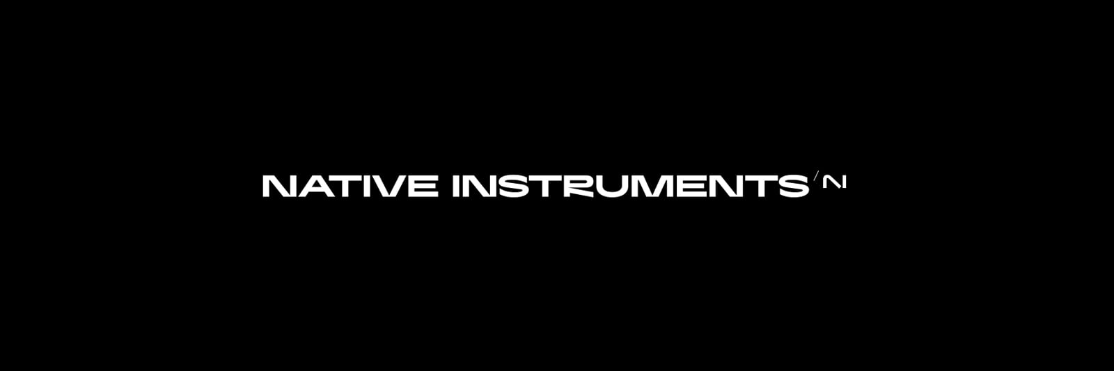
the N or is it still NI? See there's the issue. It's like they tried the the Kia thing and dropped the K. Kia 'IA' looks so much like the new N / NI. Or maybe it's a nod to A.I. coming from Izotope?
It's sort of an assumption that It's supposed to be NI because out of context I'm not sure people will get it.
Looks like a tall servant worm bowing down to the short King Worm
The logo is very good, sophisticated, elegant, and modern
The main banner is a bit wonky font wise.
The R, U, M and S are all bad. The R and U are a mess, the R looks like it hangs too low, which is compounded by being next to the U which hasn't been adjusted for having a curved base... kerning is way off - everything looks jammed together to make it fit, with wide letters, but not enough spacing to let it breath, particularly with those weird 'V' ends on the N, V and M. It just breaks too many rules and doesn't scan well. looks like it was done by some school kid for an art project!
Also seems weird that the Logo has that curve whereas the banner text is super angular - just doesn't sit together at all!
I could imagine that the new logo would look very nice on a brand new Z2 MKII 🤓
But yeah, the "R" is a mess and why always pushing the letters on one axis (condensed, or whatever)? it would never fit with a normal (regular) Font Type.
I like the new logo, modern look.
Honestly, the logo screams "Artificial Instruments". The N is barely recognizable because it's too abstract, it clearly reads AI.
The fonts of Komplete and Native Instruments are not in line with the logo, it makes no sense to me, and the /NI on top of each product makes it even more confusing and difficult to read. The R in Native Instruments is the worst part of it, as other users have said, and the K in Kontakt looks quite bad as well.
I believe that simplifying and flattening the previous logo would look way better, plus you already have a logo that everyone in the industry recognizes.
I am dubious about the logo. Too abstract. I would have continued the N to make it a real N
Yeah, not digging that new logo at all personally. Looks like a child has drawn AI with a texter, kind of has a paintbrush vibe to it.
The original logo was fine!
Not a fan of the new logo, seems an intern was given 5 minutes to design it so grabbed the closest texter. 100% prefer the old style I have grown accustomed to for a decade, but we all know these choices are never about the current users.
Yeah looks more like a P with an appendage...
I thought it was AI.
That would be a 'pendage. 🤣
It's the new Algebra, people.
N = AI
Now solve for N in a minor key.
Or maybe the AI means "All Instruments". Hey, we can get Heavyocity here, we can get Izotope here, we can get 14 different orchestras, including a kazoo-based orchestra and another one based on the mating call of the male Australian puffin. We can get almost everything made now for the NKS standard, and most of it can be bought right from the N...er "AI" site. So it all plays in Kontakt. I'm sorry, I should have spelled Kontakt as "<0AI+@<+".
But yeah, AI = All Instruments. World domination. Soon all restaurants will be Taco Bell. How many restaurants are there? Why there are N restaurants, of course!