Hello! I couldn't find any info on a couple items, so I thought I'd ask in the hopes that someone might know something.
Has there been any news about Komplete Kontrol's same-page browser returning? Since it's been implemented in Kontakt, I figured it was coming for KK. Having to flip back and forth from library to UI is a pretty significant workflow interruption and adds unnecessary lag to the sound selection process.
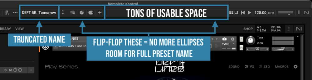
Also, it occurred to me that a simple UI adjustment would really help with on-screen info. Currently, the name of almost every instrument I load is truncated with an ellipsis. There's no way to see the full name on the main screen unless the instrument is loaded and Komplete is set to Edit View. For some third-party VSTs, there's no way to see the full name AT ALL from this screen. Have you ever considered moving the UI section buttons to the other side of the header bar and letting all that blank space be used for displaying full names? It's just dead space that could be put to good use.
Thanks!
M

