[Feature Request] - Enable Full Screen / Maximize Window in all Standalone Applications
[IMPORTANT!] To NI Community Admins / Mods / etc.
This is not a duplicate on request "Please make all UIs scalable". Please, don't close this thread.
If you have some doubts or questions about what is requested, feel free to ask. I'm pleased to help.
--------------------------------------------------------------------------------
Dear Dev Teams,
Please, enable all Standalone Applications to run Full Screen and as a Maximized Window.
For example, this is a re-work of Komplete Kontrol as if it was used as a Maximized Window:
This request applies to:
- Komplete Kontrol (Software)
- Kontakt
- Battery
- Guitar Rig
What we are asking here:
- Enable the feature to maximize the window frame, so the window frame can take all the screen size.
- Enable Full Screen (Immersive) mode, so only the application UI is showed in the screen.
We are not asking here to make all plugin UIs scalable. We are not asking for the content inside the window frame to be scalable, so no plugin UI has to be modified.
We are asking for the frame itself, the "container" within the Application runs, the basic window "shape", the UI for the "motor" itself, to be resizable.
Please, take Reaktor, Maschine (Software), Traktor (Software) or Native Access 3 as example.
--------------------------------------------------------------------------------
[The long (and boring) explanation]
Let's take a dive into the Native Access 3 graphic user interface:
When you run Native Access 3, by default it runs in a window (boxed) mode. I think this is called WS_OVERLAPPED / WS_TILED style, but I'm not a developer.
In this mode, we have a frame all around the application. (To help to visualize it, I have erased the content inside the frame).
On top of the window, we have the title bar
Below the tittle bar, we have the menu bar.
If we click on the 'View' entry in Native Access 3, we will see a "Toggle Full Screen F11" option.
Also, you can Maximize the window by clicking on the "Square Icon", to make it fill all the screen.
And it looks like this..
What we are asking for is to have the same feature available in the standalone applications for Komplete Kontrol, Konkatk, Battery and Guitar Rig.
You don't have to make all the UI resizable, just the few "affected elements".
Back to Native Access 3, for example, when in full screen mode, almost all the UI proportions stays the same size.
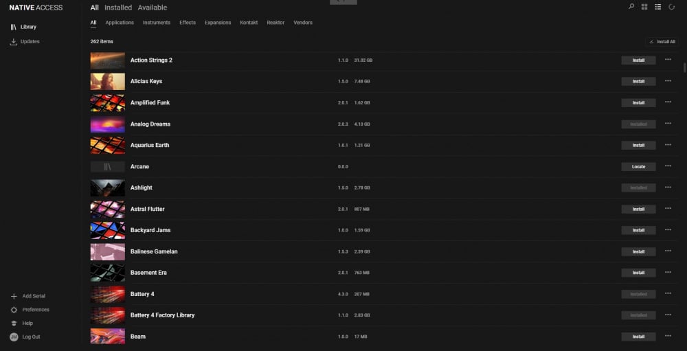
The menu in the left, the icons in the upright corner and the categories (All / Installed / Available / etc) remains at the same size. It is just the "container" or "frame" itself what is resized to fill up the screen.
In Komplete Kontrol the same principles applies. You have the menu on the left which is always the same size. You have all the buttons, options, etc in the UI which remains always at the same size.
In Komplete Kontrol, the "container" / "frame" itself resizes depending on the UI of the loaded plugin, but the rest of the UI remains the exact same size / proportions.
Example 1: Large Plugin UI
Example 2: Small Plugin UI
As you can see, when loading a plugin with an small UI, the menu on the left can get very small, making it very difficult to navigate through the presets, plugins, etc.
By allowing us to maximize the window or toggle it full screen, the app will take the size of the full screen, no matter the size of the plugin we load.
This will improve visibility of the menu and make the UI feel more concise. And also, will prevent the UI from dramatically changing the size whenever loading a new plugin.
Take a picture, if this doesn't look better for to you I will shut my mouth and buy a brand new glasses.. I swear, hahahah..
For god's sake, it even looks like if the Windows 10 UI was made to match Komplete Kontrol UI. Please, allow us to take benefit of this marvelous coincidence..
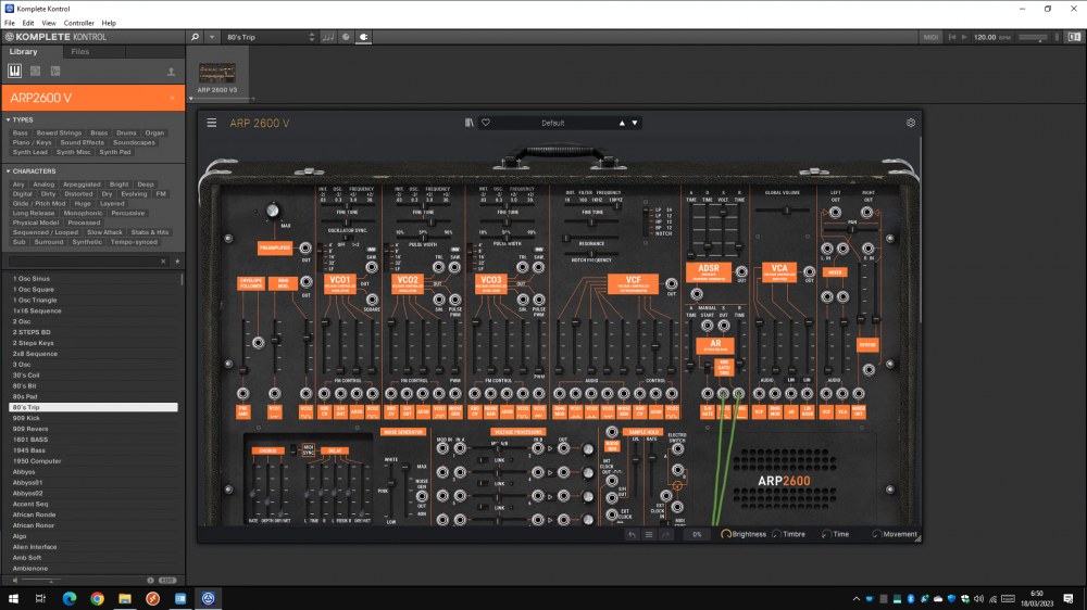
Just a few more examples..
Reaktor in Windowed (Boxed) mode:
Reaktor in Maximized mode:
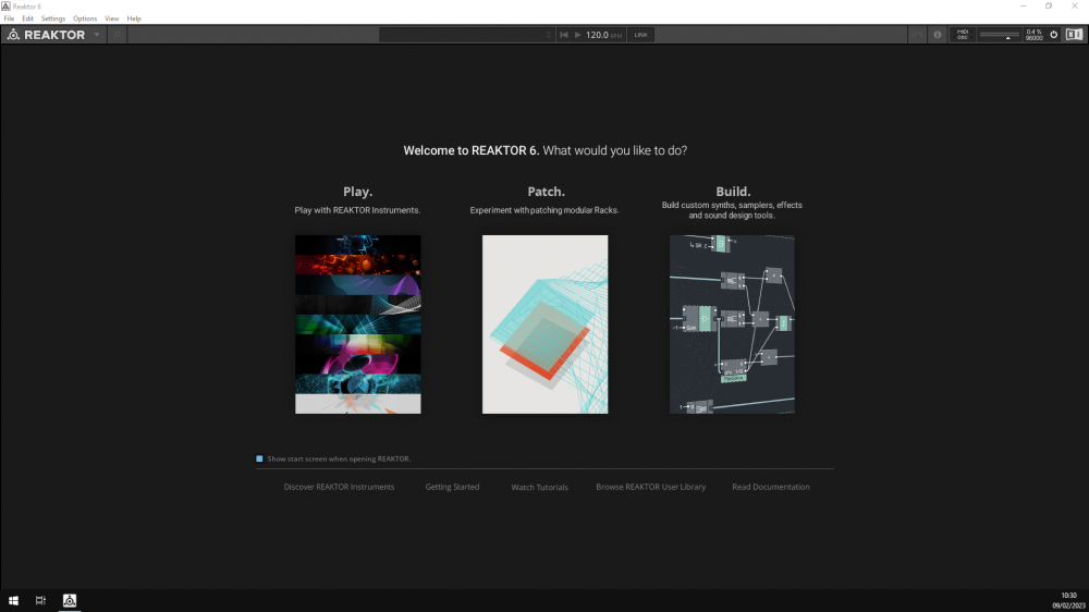
Reaktor in Full Screen (Immersive) mode:
If it can help..
Here are some links to Microsoft's Documentation about Frame Windows:
https://learn.microsoft.com/en-us/windows/win32/uxguide/win-window-frames
https://learn.microsoft.com/en-us/cpp/mfc/frame-windows?view=msvc-170
https://learn.microsoft.com/en-us/windows/win32/winmsg/window-styles
Here is what I found on Apple's Developer site about Frame Windows:
https://developer.apple.com/design/human-interface-guidelines/components/presentation/windows/
https://developer.apple.com/documentation/appkit/nswindow/1419697-frame
Thank you so much for your time.
Best regards form Barcelona,
Raik
Comments
-
@Raikro Scorp Thank you so much for adding content and creating this thread.
Native, please make this feature. I had so many previous versions of guitar rig setup on a vertical monitor and it was great because I could see the entire digital rig in front of me. Why was this available in GR5 but not 6?
4 -
PLEASE 🙏🙏🙏🙏🙏🙏🙏🙏🙏🙏🙏🙏🙏🙏🙏🙏🙏🙏
1 -
Hi @Rockguru87,
Thank you so much for helping to raise this request.
That's exactly what I wish we would be able to do with Guitar Rig 6.
Just can't wait to run GR6 in full screen mode in a touch screen. That would be awesome.
Once again, thanks for your support.
Best regards from Barcelona,
Raik
1 -
1
-
. +1
1 -
Please NI, do it now!
i'm using your products since years... but in the last months, since i have a big screen (4K) there is no longer any usability of your products... stand alone and inside my daw (studio one) as a plugin... i just don't use it anymore... and i have so many of your products... (komplete 13 collectors edition, nearly all expansions... and so on)
looking forward to use your stuff again... and hey, if you don't i will not buy anything new!!! why should i if i can't use it
Kind regards from Switzerland
Alex
3 -
In 2020 I bought the Native Instruments Komplete 13 Software Production Suite. I hardly use any of it due to the limited window size, I really regret buying it, can I get my money back, or at least some of it?
I've been using Sonic Academy's ANA 2, their gui works great! I don't even think about it while I'm using it.
2 -
Agree 100%. If implemented, this would be first step towards scalability.
3 -
Re-sizing of an application window has been a standard feature since Microsoft first introduced Windows v1.0 in 1985.
I can't think of a single excuse NI could have to justify not implementing such a basic and fundamental function.
5 -
What's worse is, the fundamental functionality is already there! The KK window already resizes itself depending on the size of the plugin its hosting. All they would have to do is expose a window handle that allows you to resize the window.
3 -
NI guys, are you kidding us?
I just bought the Komplete 14 Standard software and I'm really out of my mind that there is no full screen mode for most of your stuff! I was searching all menus for a full screen option in most stand alone programs here and thought I was too dumb to find it. I really can't believe this is not a bug or some kind of hidden option I was not able to locate.
Every single software I used so far since the early 90's utilized the full resolution of my screens to be of any practical use. Why isn't that a basic function with NI software? Still I really can't believe this.
Just imagine using MS Word or Excel or even Photoshop in an "always windowed" and much too small mode with no option to resize. No thanks. I really still can't believe this. No way this is not a bug.
This is a fundamental and basic option you MUST implement to not make yourself laughed at. Sorry to be so direct, but this is really basic stuff for any application.
4 -
Yes please :)
3 -
Same here, just upgraded to Komplete 14 and... Komplete Kontrol is like a 640x480 windows 3.1 frame.
3 -
Und hier noch auf Deutsch...;-) . Bei jedem Update von Komplete Kontrol schaue ich hoffnungsvoll nach ob man das GUI Fenster jetzt Vergrössern kann. Und jedes mal wurde ich bisher enttäuscht. Komplete Kontrol wäre so ein SuperTool bei der Suche nach Sounds. Bei dieser Mini-Bildschirmgrösse aber ist es einfach Unbrauchbar.
Wenn ich es öffne, sehe ich alle "Types"; zwei Linien der "Characters" und und gerade 4 Sounds ohne zu scrollen. So macht es keinen Spass nach Sounds zu suchen und ich öffne lieber gleich Kontakt7.
Ich kenne mich leider mit Software-Programmierung nicht gut aus, daher würde es mich sehr interessieren, wie groß der Aufwand für das Programmierens eines vergrösserbaren Fensters ist. Das kann sich doch nicht um so eine schwierige Sache handeln.
Bitte bringt dieses Feature sehr bald.
Translation: With every update of Komplete Kontrol I hopefully check if the GUI window can now be enlarged. And every time I've been disappointed. Komplete Kontrol would be such a super tool when searching for sounds. With this mini screen size, however, it is simply unusable.
When I open it, I see all "Types"; two lines of "Characters" and and straight 4 sounds without scrolling. So it's not fun to search for sounds and I prefer to open Kontakt7 right away.
Unfortunately, I am not very familiar with software programming, so I would be very interested to know how much effort it takes to program a window that can be enlarged. It can't be such a difficult thing.
Please bring this feature very soon.
4 -
Ridiculous that this has not yet been implemented - it would be great if you could sort the GUI issues out
2
Categories
- All Categories
- 19 Welcome
- 1.3K Hangout
- 59 NI News
- 679 Tech Talks
- 3.6K Native Access
- 14.9K Komplete
- 1.8K Komplete General
- 3.9K Komplete Kontrol
- 5.1K Kontakt
- 1.5K Reaktor
- 347 Battery 4
- 773 Guitar Rig & FX
- 399 Massive X & Synths
- 1.1K Other Software & Hardware
- 5.1K Maschine
- 6.6K Traktor
- 6.6K Traktor Software & Hardware
- Check out everything you can do
- Create an account
- See member benefits
- Answer questions
- Ask the community
- See product news
- Connect with creators