Perhaps it is much harder than I think, but I'm guessing that a fairly successful company like Native Instruments has the budget to hire a coder or two that will bring their GUI into the 2020s. It's fair to says that these days most people are using a monitor that is either 4k or 5k and using a HiDPI practical resolution of 2560x1440 if using at least a 27" monitor.
But the GUI for all the NI programs is terrible. Font rendering is awful even on macOS, and tiny, because it doesn't know anything about HiDPI, so it renders it at 4K or 5K. I mean, take a look at this:

Every time I have to do anything in most NI software, I have to use the OS accessibility feature that allows you to press control and move the finger up and down the mouse to zoom in or out, but it's annoying when you have to do that all the time. And those issues aside, at least with Kontakt you can make the window taller, even if it doesn't scale up the GUI. With that new Komplete Kontrol plugin that seems to be a jack of all trades and lets you load any plugin from NI and other companies, you can't even do that. It's ridiculous. You have all these filters on the left pane, by types and characters, but the filtered list only lets you see 3 items at a time:

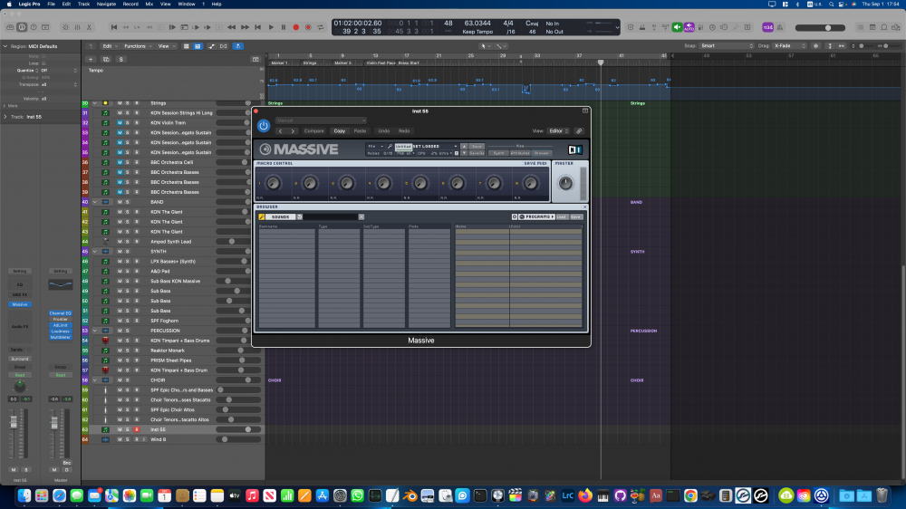
You can't resize that window to make it taller like you can with Kontakt. And it doesn't have any hiDPI option, it looks just as tiny, except that the text in the left pane is a bit easier to read. But it's practically useless. Take a look at other NI products that came with my copy of Komplete 9 I think, Absynth, FM8 and Massive:


(The text in FM8 looks even smaller than the others)

How are you supposed to see all that text? And also, where are all the instruments? I haven't opened these in a while, but I remember opening them and seeing the browsers full of instruments. But now they were all empty like Massive, and I had to start messing with menus and load them manually, and I still haven't found how to load anything in Massive. Seems like something is broken, same thing with the Kontakt libraries when you try to open the drop down menus inside the instrument, you can only press the arrow left and right, but you can't choose the instrument from the drop down menu like you could before.
So I just don't get it. I mean, Spitfire has great GUIs for their products, which render text and graphics perfectly, and you can resize scale them up if you need to, but it's even usable at their 100% size.
What I don't understand is why some big names in the industry are so reluctant to do their own thing. Project SAM has amazing libraries, and they just redid their whole GUI, but they still keep it inside Kontakt. Why? Is it really so hard to code the software needed to play sampled libraries?
But more importantly, why can't NI just change or rewrite the code? I didn't post this to be harsh for the sake of it, I genuinely want to know if it's really that hard and expensive to add proper DPI scaling to their GUIs since I doubt I'm the only one whose eyes burn after using them for a few hours.